Nokia Lumia 820 review
The Lumia 820 was Nokia's mid-range Windows 8 handset for 2012, coming a rung down from the range-topping Lumia 920 . It's since been replaced by the excellent Lumia 830 , but it's still a fantastic smartphone in its own right, as you get an AMOLED screen, 4G connectivity and Microsoft's latest mobile operating system - Windows Phone 8.1 (with a free update to Windows 10 arriving later this year). It's now cheaper than ever, too, as you can now pick one up for around £215 SIM-free, which is around £40 cheaper than its successor.
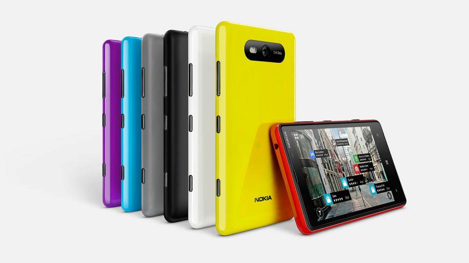
The Lumia 820 differs significantly from the 920 in terms of design. Instead of the Lumia 920's unibody and convex screen, you get a more traditional flat screen and pop-off rear cover, under which you'll find the battery, SIM and microSD card slots. The memory card slot is interesting; this is the first Windows Phone handset we've seen with expandable memory. The Lumia 920 didn't really need any more space thanks to its built-in 32GB of storage, but the Lumia 820 only has 8GB of integrated storage.
With 32GB microSDHC cards costing as little as £14 and 16GB models available for £7, you don't have to worry too much about the Lumia 820's small amount of built-in storage. Fitting the cards is another matter, as removing the rear cover is a fiddly process. You have to peel back the top-right corner, then get a grip with your fingers and snap it off backwards. The cover bends significantly during this process, but our fears about it breaking were unfounded; however, our thumb did leave a small chip in the cover, which was a shame.
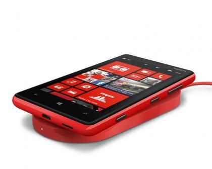
The UK Lumia 820 ships with a wireless charging-capable cover
You can buy different covers for the Lumia 820, which add different functions to your phone. The UK version comes with a wireless charging cover to use with Nokia's Wireless Charging Plate (DT-900RD, £55 from www.expansys.com ), but you will also be able to buy a ruggedized shell to make your phone tougher or cheaper fashion shells to give your Lumia 820 more personality.
The Lumia 820's 4.3in screen is only slightly smaller than the 920's 4.5in version, but it has a significantly lower resolution; 800x480 pixels rather than 1,280x768. This leads to a pixel density of 217ppi compared to the Lumia 920's 332ppi. You can see the pixels on the 820's screen, and text isn’t quite as sharp, but it's still an impressive display. Much of this is down to the fact it's an AMOLED screen, so has the deep blacks and punchy colours we've come to associate with this technology. The Lumia 820's AMOLED screen seems to use less power than the Lumia 920's IPS model, too, as the Lumia 820 lasted an hour and a half longer than the 920 in our continuous video playback test. The Lumia 820's screen isn’t made of Corning Gorilla Glass like the 920's, so is likely to be more susceptible to scratches.
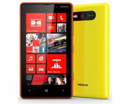
It's an AMOLED screen, but you don't get Gorilla Glass
The flexibility of Windows Phone 8.1's interface means a lower-resolution screen isn’t a particular problem. You can now resize the operating system's Live Tiles, making them small, medium or large depending on how much information you want them to show and arrange them in two or three columns. Apps that don’t show any supplemental Live information, such as Internet Explorer, can safely be made as small as possible, which leaves more room for your info-rich Photos and People tiles.
There have been some tweaks to the People app, too, namely the addition of Rooms. We cover this in detail in our Lumia 920 review , but in short it means that you can create various Rooms, add contacts to them and then elect to share various bits of information with everyone in that Room, whether it's messages, calendar appointments, photos or to-do lists.
